Website Redesign Update: Research, Feedback & Design
We’re lifting the shroud on UL Lafayette’s website redesign! After much anticipation, we’re in the thick of planning for the new website.
We want to share what we heard throughout our research and also show you what we’re doing to address that feedback.
We spent hours interviewing prospective students, parents, current students, faculty and staff, and surveyed hundreds more online. We also looked at analytics and best practices across higher ed. Based on their feedback and our outside research, we created a new website design that will support our content and storytelling in the future.
Here's what we're planning to do.
Plan: Refocus the website so prospective students are the primary audience.
What we heard: The website isn’t currently organized for prospective students, so it’s difficult for them to find the information they need.
What we’re doing: We’re rehauling the main website so prospective students can find exactly what they need. That includes:
- A new home page that highlights the student experience
- Detailed pages for each program that automatically populate in a program directory.
- A detailed breakdown of tuition, fees, scholarships, and other financial aid
- A detailed breakdown page devoted to the application process.
Here's a preview of what a Program Page template will look like. They're wireframes, which means they're not styled in any way -- they just show the type of content we'll need for each page.
|
(click to view larger) |
(click to view larger)
|
But wait: If the main website is going to be focused on prospective students, how will the rest of us find anything?
We’re creating dedicated gateway pages for each audience so your information will be in one central location. We’re also working to move more of our internal processes into ULink.
Plan: Showcase the University’s academic and research accomplishments while conveying local culture’s influence on campus.
What we heard: The website doesn’t show the range of academic accomplishments and the rich campus culture.
What we’re doing: We’re creating specific tools with templates to help us share the information prospective students need so they can choose the right school and major for them.
For the academic and research components, that includes showcasing faculty experts, sharing news stories alongside program information, and visually dynamic pieces to highlight rankings, accomplishments, and unique features — a feature we're calling a "differentiator."
For the cultural components, we’re going to highlight the arts, food, and community on campus and in Acadiana. We’ll also focus on highlighting the research and learning that takes place specifically about our cultures.
Plan: Make it easier to share information across sites to reduce duplication and manual updating.
What we heard: Content is siloed, so we can’t easily share information across sites.
What we’re doing: Instead of having each site siloed in its own area, we’re going to do some technical magic that makes it easier to share content based on a system of tags. That will work for differentiators, cultural components, faculty and staff contact information, and news.
For example: Every time there is a news story or blog published about a person, program, or accomplishment in the College of the Arts, it will be tagged “College of the Arts.” That tag will make it automatically appear on the College of the Arts home page, so we’re getting more distance out of every piece of content we publish.
Plan: Create automated directories so it’s easier to find the people and offices you need.
What we heard: It’s really difficult to find someone online — making it difficult to find contact information, to connect students with faculty, and to promote our experts on campus.
What we’re doing: We’re creating automated directories on the website that include individuals and centers/offices/departments/colleges/schools.
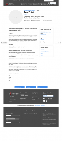
Each person on campus will have a profile on the website, which will automatically show on their office’s website and will appear in a easy-to-use directory. Each office/department/center/school/college will also have its own directory entry, so you can sort through and find those groups easily.
Click on the screenshots to view larger:
|
(click to view larger) |
(click to view larger) |
(click to view larger) |
Plan: Provide added flexibility to customize your pages using different components.
What we heard: Our current site makes it difficult to showcase different types of content. Our only option is sidebar blocks and main body text.
What we're doing: We're providing a set of "components" that you can use as you're building pages to showcase content in different ways. Some of the components are those we mentioned above: culture components and differentiators. But there are also checkerboards that feature photos and buttons, featured faculty and staff, news, events, accordion menus, and photo galleries.
What's next?
We're in the thick of content creation/modification and technical development. Read more about our timeline.
How can I see the actual designs?
If you weren't able to make the presentations, we're happy to show you what we covered! Come to our office hours on Mondays in Stephens 109A.
Have questions about the redesign? Contact Elizabeth Rose-Arcuri at elizabeth@louisiana.edu.


