Web Accessibility Tip: Avoiding "Click Here" in Links
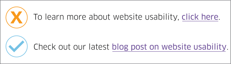
One of the most common bad practices we see in digital content online and in emails is the use of “click here” in link statements. “Click here” isn’t considered good practice for several reasons, especially in web content for universities where clarity, accessibility, and professionalism are priorities.
Poor for Accessibility
Screen readers often scan links out of context. “Click here” provides no information about where the link goes, which can confuse users who rely on assistive technologies.
Not Descriptive
“Click here” doesn’t tell users what users will get or where they will go. Descriptive link text improves usability by setting clear expectations (e.g., "download the academic calendar" is much more helpful).
Bad for SEO
Search engines use link text to understand what a page is about. “Click here” misses an opportunity to reinforce relevant keywords.
Outdated for Modern Devices
People don’t just “click”—they tap, press, or voice-navigate. “Click here” assumes a mouse and desktop context, which isn’t representative of how people actually browse today.
Better Alternatives
Use action-based, descriptive text, such as:
- "View degree requirements"
- "Register for the webinar"
- "Explore housing options"
We encourage you to review your site for “click here” references and update the statements to be action-based and descriptive. Our team is here to help if you have questions or want to brainstorm ideas for how to word your links. Send us an email or reach out to us on Teams.
Watch "click here" in Action
Instructional design and web accessibility specialist Michael Kocher provides a quick explanation with examples of why "click here" is not the right approach for your end user.