Let's talk tables & how to adjust them for mobile
Ah, tables. We're all familiar with them, but we may not be familiar with their intended purpose on the web.
Before we keep going, let's get one thing clear: tables are for sets of data. They should not be used to manipulate layout on a page. Like we've mentioned before, there are web accessibility standards and we have to be compliant across all of our websites.
Quick explanation: site visitors who don't have a visual impairment will be able to scan over an entire page and find the information they're looking for in a table without going through every cell. When a site visitor with a vision impairment (who has to use special screen-reading software) tries to find something in a table, they have to listen to every cell. For example, take a look at this photo:
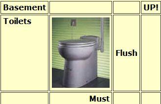
A visual user will read it as "Basement toilets must flush up!" but a non-visual user will instead hear: "Basement UP! Toilets Flush Must." Doesn't make a lot of sense, does it? That's why we can't use tables to manipulate our page layout. If you've used tables to manipulate the layout of a page, the fixes listed below won't work for you. Our best advice in that situation is to remove your information from the table and just have the information in the body of the page.
Using Table Headers
If you already have tables on your sites, you have to make sure you're using table headers. It's one of the main features that will keep your tables looking normal on mobile. Those headers just need to describe the data that the column or row holds.
If you need an example of table headers, take a look at the Bursar's site, which uses headers to align information about tuition & fee amounts.
Adjusting Widths
When creating tables for desktop and mobile, there are some things you just gotta do. All of that centers around the battle between pixels and percentages.
This conversation about tables has the potential to get pretty technical, so I'm going to keep it as simple as possible.
As we've mentioned before, tables and the mobile site don't mix well. Basically, it's because the mobile sites can be only as wide as a device's screen size, which is set by a certain number of pixels. And if your tables are set to a certain number of pixels wide, that set number does not change when you look at it on a mobile device. When that happens, your table will not fit in the mobile screen width — and it'll get chopped off on the side, omitting some information. And we don't want that.
Please note that this only applies for tables with data in them.
Adjusting Table Width
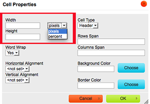
 To give you a better idea of what I mean by pixel width, here's a screen shot. To get to this information on any of the pages in your site, right click in any cell and select Table Properties.
See how the width is set to 400 pixels, but the height is set to 90%? We want them both to be percentages. When it's set to a percentage, that tells your site that the table should take up that percentage of the page's width. Generally, we say to change it to 80% to 90%, just so we guarantee there is enough room.
Adjusting Cell Width
Now that we've changed the table width to percentages, we need to change the cell width to percentages. We want to tell each cell to take up a certain percentage of the table width, so they fit evenly. That requires a little bit of math — if you have two columns, you want each to take up 50%. If you have three columns, you want each to take up 33% ... and so on.
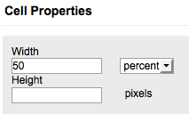
To do that, select all of the cells in your table and right click. From there, navigate to "Cells" and then click on "Cell Properties." In that window, it looks like this:
The items inside the red box are what matter here. First, you'll want to change that drop-down box from pixels to percent. Then, in the box labeled "Width," you'll want to put the percentage width you want (50% for a two-column table, 33% for three columns, 25% for four columns, etc.). Because I had two columns in my table, I inserted 50 percent, so now it looks like this:
The Fine Print
This fix will not be a panacea for all tables. As mentioned earlier, it's only for tables with sets of data in them. A lot of you have been having trouble with tables on your sites, especially with your faculty and staff pages. We have pinpointed the problem with those, and I have a short-term solution handy if you need it. However, if you can wait just a little longer, our web developer Ryan will have a solution in place soon. Just email me at webcontent@louisiana.edu if you need your quick fix.
Good news is that this is an improvement for tables on mobile and desktop. If you've ever had problems with your table running off the side of a page's content body, this will fix that.
As always, we're here to help. If you need step-by-step instructions or have more questions, get in touch with me at webcontent@louisiana.edu or Sasha Rodriguez at training@louisiana.edu.